Sometimes I get stuck in a photography rut. It’s the most frustrating thing to snap snap snap, just to look down at my 3in screen and realize that I bombed bombed bombed. No bueno! The easiest trick to change your perspective – in the frame and out – is to change your photo composition. These photography composition tips will hopefully help other moms and beginning photographers.
Photography Composition Tips
Shooting in full Manual mode has been the #1 improvement in my photos, followed closely by manually adjusting my AF points, but none of those things matter if the picture isn’t composed in an aesthetically pleasing way. So here are a few composition tips and tricks I have learned and need to keep working on:
Rule of Thirds: The idea is to have your subjects near one the of the intersecting points, allowing for open/empty space in an image. Your subject will be slightly off centered to express an interesting composition.
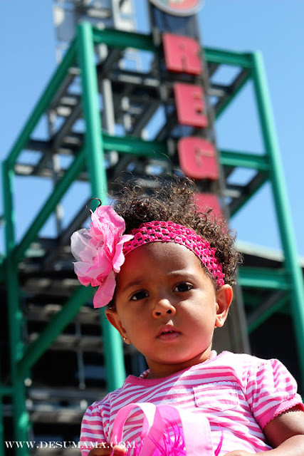
I haven’t researched that intensely, but I am not sure why this rule is sooo important. Maybe its my budding photographic “style” but I like my subjects front and center, with a slight ruling to either side. This picture above of my beautiful baby niece {who turns one next week!} is the best example of my photography following the rule of thirds. But sometimes your little subject is just yearning to be stage center. And who could ever deny this face…
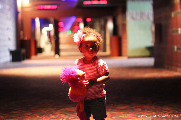
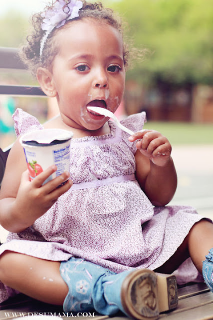
Camera Angels: Now this is one rule I LOVE to follow and am always trying to get better at. Have fun trying to come up with different ways to photograph the same subject. Your washer machine won’t be happy, because you are likely to get pretty dirty, but you’ll get some really cool shots! I always challenge myself to shoot pictures of Alina is ways that tell the story. In the picture below, she was heading to the movie theaters to watch her first movie. In any other picture, the distracting background would have been annoying, but I love how the photo fits beautifully in with the experience.
{3.} Focal Points:
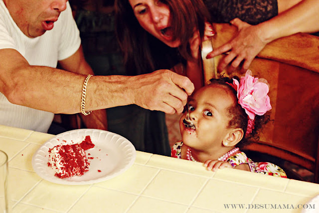
Controlling the sharpness in a photo really helps draw the eye where you want it to go. Adjusting your AF points manually will help. You can also achieve this by opening your aperture and creating a blurred background. I follow this rule very often in my food photography, when I want you to see something, and know its there, but not focus on it.
{4.} Lighting Source/Contrast:
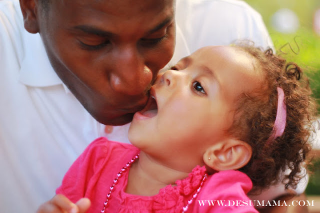
There is this glorious thing in the photography world called lighting. Capturing it correctly may be the one skill I would like to improve this summer. In my experiments, I have learned quite a bit on the best way to photograph varying skin tones, specifically my husband’s. He is dark skinned, and has the most beautiful reddish undertone that, when properly highlighted, can really make a picture pop. I would have never learned that without adjusting my light source around him, at a slight angle {creating highlights}. Here, the sun was center left. But the biggest difference was the aluminum picnic table we were sitting at, which acted as a natural light deflected. Check out my post at Multicultural Familia on photography tutorials!
{5.} Filling the Frame/ Cropping:
I aim to do this in-camera. Sure, you can always crop a photo in post using editing software. But that can have huge effects on your photo quality. Professionals aim to shoot for the photo they want, versus editing the photo they have, and I agree its probably a good habit to get into.
Happy shooting!



Kris Martinez
July 14, 2011 at 11:57 pmWhat a fantastic hobby you have found yourself. All the pictures just look great.
Weather Anchor Mama
July 15, 2011 at 5:54 amThanks! I’m about the same complexion as your hubby. Is back lighting an actual feature that you select on the camera. Or do you create it by placing an actual light or reflector behind him?
Your niece is beautiful! Who is the little one below her. I love that pic too, and the way it’s angled and lit! I also really like the pic of Alina in the boots! She’s adorable! Great job, great tips! Thanks again!
De Su Mama
July 15, 2011 at 3:01 pmBack lighting is just the idea of having your light source {the sun, in this case} behind you, instead of in front like most any photography class will tell you to do. I have found having too much direct light on the Hubby makes his skin look really flat. I am looking into reflectors, but this picture was taken outside while sitting at a table {a natural reflector} with the sun setting to his left. Completely behind him would not be enough light, but at an angle gives him highlights.
Hope this helps! The little boy is Alina’s main dude. He is mixed, too 🙂